The Great Wave Off Kanagawa: A Non-Western Work of Art

Image

For my second non-western work of art, I chose The Great Wave off Kanagawa, or 神奈川沖浪裏.  This can be literally translated as “Under a Wave off Kanagawa.” Image from here.

I specifically chose this work because my last non-western work was a piece related to China/Taiwan (see Jadeite Cabbage in my previous blog post).  Though the Jadeite Cabbage and The Great Wave off Kanagawa are both works from the Asian region, this work came from Japan instead of China (and thus utilized a different style, which is why I feel it deserved its own blog post).  Though the Japanese region and China region are very close in proximity, there are many differences art and art culture.

This work is one of the most famous works of Japanese art, created by Katsushika Hokusai in the 1820s (exact date unknown) in Edo, Japan.  This was actually a woodblock print, meaning water-based inks were used on thin blocks of wood. The Japanese’s usage of water-based inks provided many bright colors and glazes, and also still offering transparency.   This piece is on display in many western collections, for instance in museums in London, Chicago, and New York City (of course, they are copies of the print) [Wiki].

This particular work is of the Yoko-e style. Here, single works were produced with brushes that displayed many lines, forms and colors on paper that were then engraved to a panel of wood and carved away.  I particularly enjoy this piece because it makes me feel a sense of tension in the air, with a disaster looming over the sky (in this case, literally looming over the sky [wave]). Here, there are three boats in the presence of an enormous wave all set in the prefecture of Kanagawa [Wiki].  All of this occurs in the backdrop of Mount Fiji.  I have actually seen this work in many fancier restaurants when I was on exchange in Taiwan.  I feel this is a great representation of Asian art, as there is a clear distinction when comparing this work to any works created in the western world.

This piece has been interpreted as a work that displays the courage of man to face obstacles much larger than he himself is (in this case, nature) [Kinsner].  Though Mount Fiji is smaller in the background, the wave presents itself as an enormous obstacle to the three fishermen boats simply trying to catch fish.

Sources

 http://en.wikipedia.org/wiki/The_Great_Wave_off_Kanagawa#Image

 http://www.ee.umanitoba.ca/~kinsner/about/gwave.html

Non-Western Art: The Jadeite Cabbage

ImageThe Jadeite Cabbage: 翠玉白菜, literally translated as bluish-green Chinese cabbage. Date and location, as well as artist, are unknown. First displayed in the 1800s. Photo found here.

For one of my selections of a non-western work of art, I chose the Jadeite Cabbage. The reason I specifically chose this work is because I’ve seen it in person at the National Palace Museum in Taipei, Taiwan when I was on exchange last year.  This is one of the most famous works of art in the museum (and it is an enormous museum).  Unfortunately, the date of its creation and its creator are both unknown. It was originally on display in the Forbidden City in the palace of Consort Jin Fei, a concubine of the Guanxu Emperor in the late 1800s (Wikipedia). It was put in the Consort’s palace presumably as a gift for Fei, to bring her luck as she attempted to have children with the Emperor to ultimately have an heir to the throne.   Unfortunately, she never was able to have children. After the fall of the Qing Dynasty, Fei past away and this piece of art was relocated to the Palace Museum in the Forbidden City.  It stayed in the Palace Museum until its relocation and display in Taiwan around 1965.

This work itself has its own room in the museum in Taiwan, with dim lights centering on this masterpiece.  The reason why this work is so special is due to the intricate detail put forth to create it, and also its utilization of the materials’ imperfections as part of the sculpture.  That’s what especially made this piece stand out from previous jade works. Jade works were usually flawless, without cracks or color variation.  Jadeite is a material that is extremely similar to jade, but carries opaque patches and cloudy/white areas (WSJ).  This piece has both crack flaws and a color variation near the leaves of the cabbage. The sculpture itself is only about 19cm long, 9cm tall, and 5cm thick.  For it’s small size, it carries an incredible amount of detail.

The flaws on the cabbage were incorporated into the veins in the cabbage’s stalks and leaves.  There’s actually two bugs carved into the cabbage with antennas (they can be seen in the photo, on the green area of the cabbage), and they’re actually standing on their insect legs. This shows a remarkable achievement of precision on this work, because jade is an extremely hard material that requires extra grind/sand work to carve. I can’t even begin to imagine how much time it took the creator to carve out the insects on this piece.

As for an interpretation (considered an allegory of “female virtue”), the white stalk of the cabbage is suppose to symbolize purity. The leaves symbolize fertility and abundance, while the locust and katydid (cricket) represent children (Wikipedia).  I think this is a beautiful work that definitely deserves the attention it garners.

Sources

http://en.wikipedia.org/wiki/Jadeite_Cabbage

http://online.wsj.com/article/SB118549131061379569.html

A Breakaway in Concepts from Traditional Paint Brush and Canvas Art Styles

I chose to analyze works from both Judith Baca and Mariko Mori, two post-modern era artists that have created artwork which I feel exemplify characteristics of post-modern era art.

Judith Baca was born on September 20th, 1964.  She is an American artist, and works at the University of California in Los Angeles as a professor in the fine arts department.  She is most famous for her creation of the Great Wall of Los Angeles, a work that spans over 2500 feet in Los Angeles. It is a mural located near the flood control project in Los Angeles, California (Wikipedia).

Her outdoor painting concepts came from her college years, between the years of 1969 and 1979 where she received a bachelor’s degree and a master’s degree in art from California State University in Northridge. She wanted to create art for her family and people in the town she grew up in (Watts, California), but knew that these folks didn’t go to galleries.  Thus, she decided to create works that had a much easier way to appreciate: by making them more accessible and easily viewed by their large sizes. The first work I want to show is The World Wall: A Vision of the Future Without Fear.

Image

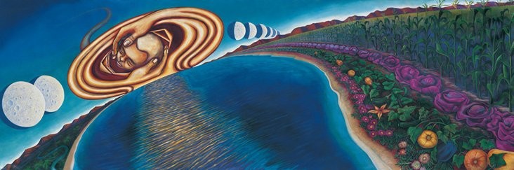
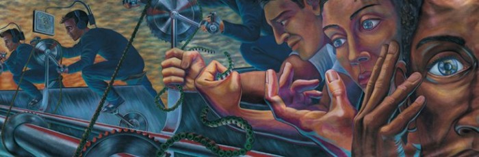
An aerial view of The World Wall

Image

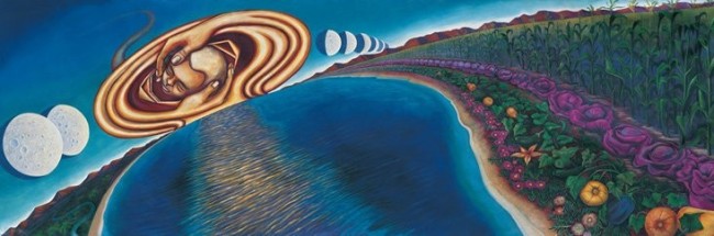
Balance – A panel from World Wall

Image

Hands – A panel from World Wall

Image

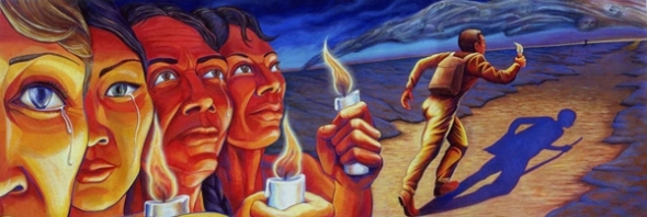
Nonviolence – Another panel from World Wall

Image

Triumph of the Hearts – A panel from The World Wall

All World Wall images can be found here.

The World Wall was created in 1987 and worked on for three years, where it was premiered in Joensuu, Finland in 1990. She worked on the paintings in California (presumably Los Angeles, where her home is).  I enjoy this painting because of its concept.  It promotes world peace, and it is a message of hope.  Each image has certain titles, such as Balance, or Nonviolent Resistance.  These titles clearly state the meaning behind the paintings. Her use of color and realistic depiction of humans truly conveys the meaning she’s trying to pass on.   This work relates to my theme because it’s definitely not typical/traditional art form previous art eras.  It’s a traveling mural that’s pushing for peace, and hope for better worldly relations.  The images shown above are the panels that are in the World Wall mural display.

Image

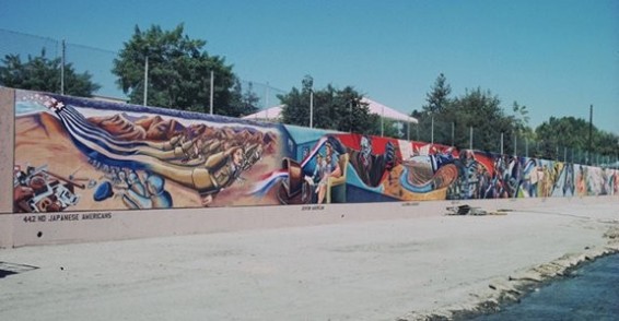
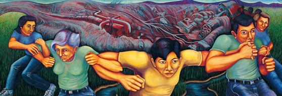
A short clipping of Baca’s mural: The Great Wall of L.A. (image can be found here).

The Great Wall of Los Angeles took seven summers to complete (the project began in 1977, and was completed in 1984.  The Great Wall of Los Angeles is located in Los Angeles, California (where it was created). It was a project that utilized the local talent of some 400 or so young adults, painting the history of Los Angeles along the span of the mural.  I enjoyed this painting because of its outdoor concept.  At first I wanted to consider it graffiti, but afterwards I realized it was much more than that. This relates to my theme because it’s an outdoor mural…that spans over 2500 feet! (Well, 2754 feet to be exact). It’s definitely not traditional art in this regard!

Image

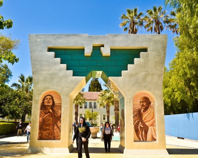
 The Arch of Dignity, Equality and Justice – by Baca (Image can be found here).

Created 2008 in San Jose California.  This arch is a beautiful work that really exemplifies cultural architecture (the appearance resembles adobe materials from the earlier Mexican tribes).  I like this work because of its detail of the two works on either side of the arch, culminating with an eagle sign in green bricks on the top.   This is definitely not something I would think of as traditional art (especially when I think paint brush, easel and paint).  This is a large break away from traditional arts.  It is also not a live-in building, it was built for aesthetics (compared to the fancy architecture of buildings and castles in the past three-four centuries, which were meant for living in).

Mariko Mori (or 森方里子), is a Japanese video and photographic artist born 1967 in Tokyo, Japan.  She studied at a fashion college, where she also worked as a fashion model in the late 1980s.  This experience strongly influenced her earlier works where she dealt with exotic scenarios and alien creatures.  In 1989, she moved to London to continue her studies at the Chelsea College of Art and Design (Wikipedia).

Her art strives for alien type landscapes, delving into exploration of originality, emotions, and spirituality.  Examples of this include her art piece Oneness, which has been said to represent spirituality, photography and fashion with an original twist (Wikipedia). Below are three works of art from Mori.

Image

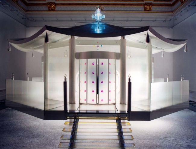
Dream Temple by Mori (Image can be found here).

Created in 1999 (presumably in N.Y., U.S.), but has toured the world at several different countries in art exhibitions.  I enjoy this piece because I actually feel like it ties in with yoga (something that I have been doing for the past couple semester).  This work is rooted in the concepts of achieving liberation of body and spirit, focusing on energy, meditation and even technology. While yoga doesn’t necessarily have to do with technology, the usage of the technology in this work of art is actually very complex.  Mori uses color shifts which are made possible by dichroic glass.  This work of art appears so new-age, so contemporary that it just seems like its an intentional break away from traditional arts.

Image

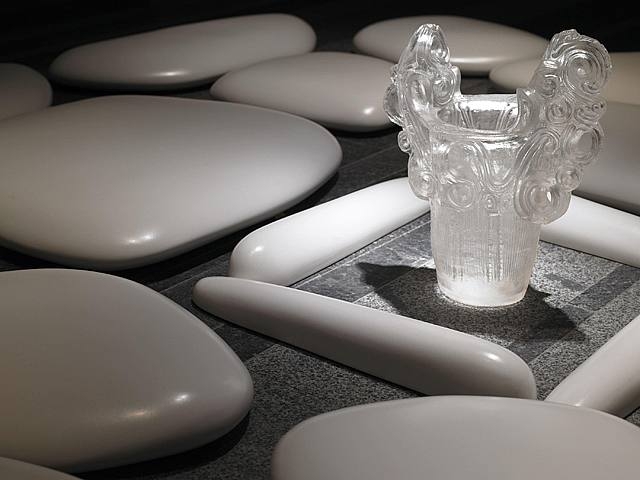
Flat Stone – by Mori (Image can be found here).

Created 2007 in New York, United States. Had many location-varied premieres such as Hong Kong, Paris, Tokyo.  I enjoy this work simply because it reminds me of rocks you may find in a zen garden, a place of peace and tranquility.  This art is a special break away from traditional arts, as I have never seen any type of art like this in any of the previous art eras.

Image

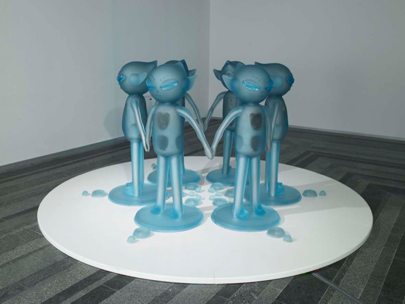
Oneness – by Mori (Image can be found here).

Created during 2002 (presumably in N.Y., U.S.), but has also toured the world in several different country’s art exhibitions.   Oneness is a symbol of connectedness, and being together (representative of the world as one connected organism).  I enjoy this work of art because of this concept. As the world grows more technology dependent, people appear to actually be less social (in person) than in past years.  Even though this appears to happen, we are all connected regardless, as we are all humans on this earth.  A simple look at this work of art can remind the viewer that we are all in this together.  This fulfills my theme as it’s a work containing aliens, a topic that doesn’t really seem traditional when in the field of arts.

Conclusively, the works chosen in this exhibition show a push towards art styles and techniques not seen in previous art eras. From extremely long (and outdoor) murals to space-age looking sculpture displays, Baca and Mori both display traits of the post modern era well.

 Sources

http://www.judybaca.com/now/index.php?option=com_content&view=article&id=154&Itemid=95

http://en.wikipedia.org/wiki/Judy_Baca

http://en.wikipedia.org/wiki/Mariko_Mori

http://fyeahwomenartists.com/post/14269773236/judy-baca-cesar-chavez-monument-the-arch-of

http://www.artnet.com/artwork/425995461/140578/mariko-mori-flat-stone-detail.html

http://www.perrotin.com/Mariko_Mori-works-oeuvres-15127-6.html

http://www.absolutearts.com/artsnews/2000/03/29/26767.html

http://www.perrotin.com/Mariko_Mori-works-oeuvres-14115-6.html

Early Modern Art: The Dada Movement, Marcel Duchamp and L.H.O.O.Q.

ImageMarcel Duchamp’s Mona Lisa altered and titled L.H.O.O.Q. done 1919, in France. Piece can be found here.

I decided to do my analysis on a visual piece of art created out of the Dada Movement.  This particular work of art is by artist Marcel Duchamp, done in the year 1919 in France.  This particular piece is called L.H.O.O.Q., or in French “el ache o o qu.” This title is actually a pun on the French language, because when it is said in French it forms the sentence “Elle a chaud au cul” which is roughly translated as, “She has a hot ass.” (Wikipedia).  I chose this work of art because its relation with WWI is extremely apparent, and this piece of art is non-traditional in so many ways.

First, a little background on Marcel Duchamp.  He was born July 28th, 1887 in Blainville-Crevon, France.  Duchamp was a French-American artist that strongly influenced the arts post WWI.   His beginning works started out post-impressionist, but as time moved on he began to be a strong force for the Dada Movement.  Duchamp was also one of the beginning artists to use “Readymades,” which are objects found and possibly modified to be presented as art. This Mona Lisa modification is an example of that, taking a pre-made work of art and adding alterations.

L.H.O.O.Q. was a work of art that was part of the Dada Movement in Europe, a movement towards non-traditional arts in reaction to WWI (About.com).  This particular work was considered shock art, due to its mildly obscene title and comical modifications.    Nobody in the past would think to alter Da Vinci’s Mona Lisa, particularly in the manner Duchamp did.  He drew a curled mustache and a go-tee on the woman’s head, and gave it a raunchy title. Many coined this technique gender reversal, which Duchamp enjoyed doing.  L.H.O.O.Q.  falls under this category of shock art because it does just this to an audience trained to appreciate traditional works of art, it shocks them.

Continuing on with the notion that WWI was the instigator of the Dada Movement, many blamed that WWI was a result of tradition.   Dada Movement supporters argued that if tradition caused WWI, tradition had to be broken to ensure something such as WWI wouldn’t occur again.   Again, the consequences of WWI were to create arts breaking tradition.

Another interesting side note to show Duchamp’s apparent desire to flow against the grain was his female pseudonym, named Rrlse Selavy.  Translated, this name means, “Eros, that’s life.”  (Wikipedia).  Duchamp obviously carried a comical lifestyle in the subject of visual arts, with a sarcastic undertone as well.

This work of art has almost a laughable affect on its viewers (I’m sure it didn’t have that same affect during its production period towards viewers), but it definitely stirred up the visual arts world after WWI.  That is one of the reasons why I appreciate it so much.  I used to do comical alterations to images in textbooks back in the 1st or 2nd grade, knowing it was not right having a history book with a picture of Napoleon holding a pitchfork and wearing Viking horns on his head. I’m glad somebody was doing this way before me, and for a more important reason: being a key player in The Dada Movement.

Sources

http://en.wikipedia.org/wiki/Marcel_Duchamp

http://en.wikipedia.org/wiki/L.H.O.O.Q.

http://arthistory.about.com/cs/arthistory10one/a/dada.htm

Impressionism: Opinion and Analysis

I’ve found impressionism to be something I enjoy, it’s very appealing.  I especially enjoy visiting scenic areas, so I’ve learned to appreciate the finer parts of lighting, weather, landscapes and geographical features in paintings when it deals with outdoor depictions.  Lighting and weather are two characteristics at the forefront of the impressionistic style.  I’ve chosen three pieces that, in my own view, seem to exemplify the qualities of impressionistic works that I enjoy.

Image

Photo taken from here.

My first work I’d like to talk about is John Singer Sargent’s Breakfast in the Loggia.  Created in 1910 near the outskirts of Florence, I enjoy this piece because of it’s attention to lighting detail (Wikipedia; Sargent).  It seems to peaceful, to be having a breakfast under an awning-style yard, with the sun shining through the trees in a presumably clear-skied day. I could imagine eating grapes, breads and some fine cheeses if I was partaking in the breakfast depicted in this image. I like to squint my eyes a little bit and stare at it from a further distance, allowing the image to really have a 3-dimensional look.  The colors used definitely seem to contain the impressionistic style, with mixes that help convey lighting on 3-d objects and such.

Image

Photo taken from here.

The second work I enjoyed is Claude Monet’s Poplars near Argenteuil. This piece was painted in 1875 around the suburbs of Paris, France in Argenteuil sub-prefecture (Wikipedia; Monet).  Now, this piece really brings me back to a few memories I experienced as a child when visiting my extended family in Iowa.  Iowa’s a flat area, with very gradual hilly areas that are usually laden with rows of corn, occasionally flowers and the occasional tree here and there. Again, the short brush stroke effect almost makes the painting appear to be pixilated when closely inspecting it. The effect of the colors and lighting depicted on the landscape really allow the viewer to experience the serenity of the said landscape. I can imagine a breeze lightly rolling through the foliage, creating a slight brushing sound.

Looking at works of impressionism, I feel that impressionism is completely different than works of any of the previous eras. Granted, there were similarities with concentrations on lighting effects within the paintings (when comparing impressionism to the Chiaroscuro technique from the Italian Renaissance).   Chiaroscuro utilized very dark colors with very light colors, creating a 3-d effect. Impressionism didn’t use so much the very contrasting colors, but rather it mixed colors in such a way that making a certain color a little lighter/darker truly brought out the lighting effects.

Another characteristic of impressionism is its in-depth analysis of how the eyes perceive art.   Art from previous eras did not seem to have this in-depth analysis of how the eyes perceive art. An example of impressionism eye analysis includes Paul Cezanne, the “Father of Abstract Art.” Cezanne studied how the eye perceives lighting and colors.  The eyes will truly focus on the center of it’s aim, so Cezanne took advantage of this and created the details portion of the painting in the center, and used less detailed painting/strokes near the edges. Techniques such as this truly revolutionized painting, and Cezanne ushered in the birth of a new style with his style.  A piece that shows this style is Pyramid of Skulls, painted circa 1901 in France (Wikipedia; Cezanne).  Notice the detail within the center of the picture, but along the edges the painting seems to dullen/darken and resolution diminishes.

Image

Photo taken from here.

Sources

Wikipedia. Claude Monet. (http://en.wikipedia.org/wiki/Claude_Monet)

Wikipedia. John Singer Sargent. (http://en.wikipedia.org/wiki/John_Singer_Sargent)

Wikipedia. Paul Cezanne. (http://en.wikipedia.org/wiki/File:Paul_Cézanne,_Pyramid_of_Skulls,_c._1901.jpg)

An Analysis of Classical Era Music: Middle Class Economic Growth

Mozart Piano Concerto No. 25 in C Major, K 503.

Haydn Symphony No. 103 “Drum Roll

Beethoven Piano Sonata No. 30 Op. 109

(Click Links to hear performance on YouTube)

Image

(Photo from: Pure Adventures)

The growing economic power of the middle class during the 1700s changed music forever in the 18th century.  In the early 18th century, many of the aristocrats had access to leisure activities and music that was unattainable to the middle class. As the 18th century progressed, a middle class began to rise out of the peasant class (comprised of many skilled workers including bankers, craftsmen, merchants, etc.). The new middle class possessed higher income than the peasant class, and were able to spend some finances on leisure activities and subjects such as music (All Purpose Guru). While the middle class was not able to enjoy the same type of music that the nobility class/aristocrats could enjoy, the middle class began to enjoy a new form of music that was easier to understand and had better accessibility: Classical Music.

The exposition in this analysis is strictly relegated to the musical differences that came about due to the growing power of the middle class in the 18th century.  A few pieces analyzed include Haydn’s Symphony No. 3 ‘Drum Roll’, Mozart’s Piano Concerto No. 25 in C. Major, K503, and Beethoven’s Symphony No. 4 in B Flat Major (Op. 60). These songs were chosen because they exemplify the characteristics of the classical music era, with the formation of the sonata, the symphony, and an overall style of music easier to interpret when compared to Baroque Era Works.

The music desired by the middle class was a style of music more easily understood when listened.  Due to the increase in finances in the middle class, the middle was able to begin learning about music. In some cases, middle class individuals learned to play instruments. While the musical/arts education the middle class endured wasn’t as in-depth or sophisticated as the aristocratic class, it was enough to give the middle class a view of what they wanted in music.  Music that was accessible and easier to understand. An example of a push towards more easily understood music is the Rondo form.  In the Baroque Era, Rondo form was considered to be in the form ABACABA (where the main tune was revisited several times).  Classical Era changed this Rondo form to ABA or ABACA, cutting down the changes in tunes and structures.  This resulted in a less complex form of Rondo during the classical era (EHow).  As music began the shift from the Baroque to the Classical Era, many famous composers began to make pieces that catered to the middle class. Vienna, Austria produced some of the most famous classical music composers that we hold so dear today.

Mozart’s Piano Concerto No. 25 displays a move towards simplification by being a Solo Concerto, differing from a Concerto Grosso which utilized more than one soloist (Wikipedia; Mozart).  This move shows simplification and yields a more concentrated performance where the audience can focus solely on the soloist’s performance (in this case, the piano soloist).  Completed December 4th, 1786 in Vienna, this piece contained three movements:

  1. Allegro Maestoso
  2. Andante in F Major
  3. Allegretto.

Writing this piece in three movements also shows the more organized style of the Classical Music Era, as music was commonly split up into three or four movements.

Haydn’s Symphony No. 103 “Drum Roll” I feel puts the classical music era into a nutshell.  Composed between 1794-1795 in London, this symphony contains four movements that follow the characteristics of a classical era symphony to a tee. The first movement has an opening drum roll, and the piece starts out with bass instruments playing a deep theme.  The theme is revisited several times throughout the first movement. The second movement is a theme of variations, jumping between C minor and C major.  The third movement is a minuet, and the final movement is a fast tempo piece in sonata rondo form (Wikipedia; Haydn).  This follows the format of a typical symphony, allowing the audience to easily interpret the piece as each section’s style is more or less known by the audience.

Beethoven’s Piano Sonata No. 30 Op. 109 showcases a piece that is complex and differing from a typical sonata form work, but at the same time still retains the three movement characteristics and is able to be interpreted at basic and complex levels. Composed in 1820 in Vienna, the piece contained three movements:

  1. Vivace, Ma Non Troppo and Adagio Espressivo
  2. Presitissimo
  3. Gesangvoll

According to Wikipedia, this piece is “characterized by a free and original approach to the traditional sonata form.” Though there are some differences from the standard sonata model (it has been said the piece can be balanced into two movements), many musicologists still divide the piece into three movements while performing analysis (Wikipedia; Beethoven).  I feel this piece is versatile because listening to it, it sounds much more complex than one would imagine, when the term simplified comes to mind. I feel this piece caters to both the higher classes and the middle classes during the 18th century.

Analyzing these three musical works shows a definitive progression towards a more ‘cut and dry’ form of music if you will. Not dry in the sense of boring and uninteresting, but a style that’s more easily understood and plainly stated than before the classical era. Comparing these pieces to a piece such as this, from the Baroque Era, a distinction can obviously be made that allows us to understand why the middle class pushed for a more easily understood structure of music.

Sources:

Classical Music: The Birth of an Idea. All Purpose Guru. http://allpurposeguru.hubpages.com/hub/Classical-music-the-birth-of-an-idea

Main Difference Between Classical and Baroque Music. EHow. http://www.ehow.com/info_8082541_main-baroque-music-classical-music.html

Piano Concerto No. 25, Mozart. Wikipedia. http://en.wikipedia.org/wiki/Piano_Concerto_No._25_(Mozart)

Piano Concerto No. 25, Mozart. YouTube. http://www.youtube.com/watch?v=OD1mB0SIxFA

Piano Sonata No. 30, Beethoven. Wikipedia. http://en.wikipedia.org/wiki/Piano_Sonata_No._30_(Beethoven)#First_movement

Piano Sonata No. 30, Beethoven. Youtube. http://www.youtube.com/watch?v=MYMuNCUdTI8

Symphony No. 103, Haydn. Wikipedia. http://en.wikipedia.org/wiki/Symphony_No._103_(Haydn)

Symphony No. 103, Haydn. YouTube. http://www.youtube.com/watch?v=n0HZ8WXC-bs

Portrait of Pope Innocent X: A Baroque Era Work of Art

Image

I’ve decided to analyze the piece of art, titled Portrait of Pope Innocent X, created by artist Diego Velazquez.  This painting was created sometime in Italy during 1650.  Velazquez was one of the top painters in the court of King Philip IV.  I’d like to analyze the royalty influence in the painting, as well as the religious influence in this work of art.  I especially liked this painting because at first, it seems so basic. After spending time analyzing it’s characteristics and appreciating it, this work of art appears to be a pinnacle painting of the Baroque period.

During the Baroque period, many members of the ruling class patronized the visual arts to a high degree.  Trade with the Americas and different countries began to grow, and the demand/market for art began to increase.  During the Baroque period, the visual arts had an increase in demand, and artists were enduring an economic boom.  Velazquez created this painting while on a trip to Italy, sanctioned by King Philip IV (Wikipedia).  As one of King Philip’s top artists, he traveled around creating many various works of art on behalf of King Philip, and even for himself. He created many works under the behest of King Philip.  While this piece of work had a strong royalty influence behind it (mainly due to the appointed position of the king’s court artist), I would also like to think that this specific work was a proponent in the Counter-Reformation efforts of the Catholic Church (Wikipedia). It was beneficial for the Catholic Church, possibly to heighten the image of Pope Innocent.  While this was simply a portrait of the Pope, doing this work at such a pivotal time of political and religious certainly had positive ramifications for the Catholic Church.  This painting appears to put Pope Innocent in a position of glory and power, sitting in a large chair with elaborate, red clothing.  In his right hand, he holds a letter addressed to him from Velazquez (Fahy).

More specifically, this painting was created when Velazquez visited Pope Innocent X in Italy, expressing his desire to create a portrait of Innocent. Initially doubtful of Velazquez’s painting ability, the Pope allowed him to create a portrait that Innocent X immediately fell in love with.  The painting continues to be studied to this day, with even renditions of it created in the past few decades. A notable artist who studied this work was Francis Bacon, an Irish-born British painter (Wikipedia).  He re-created this painting with abstract lines and colors, but still maintaining most of the portrait (done around 1950, Wikipedia).

The painting utilizes many trademarks of the Baroque era visual arts, including special lighting, strong facial expressions, emotions, and definitely a special attention to the fine details in this work of art. The Portrait of Pope Innocent X has indeed been hailed as one of the hallmark Baroque era works of visual art.

Sources

Fahy, Everett. A History of the Portait an Its Painter.  (http://www.metmuseum.org/pubs/bulletins/1/pdf/3258522.pdf.bannered.pdf)

Wikipedia. Baroque Painting. (http://en.wikipedia.org/wiki/Baroque#Painting)

Wikipedia. Portrait of Pope Innocent X. (http://en.wikipedia.org/wiki/Portrait_of_Innocent_X)

Wikipedia. Francis Bacon.  (http://en.wikipedia.org/wiki/Francis_Bacon_(artist)#1950s)

Landscape and the Fall of Icarus: A Humanist Analysis of a Northern Renaissance Piece of Art

Image       I would like to analyze the painting, Landscape with the Fall of Icarus, painted by Pieter Bruegel.  Rife with meaning through thorough analysis and observation, it can be seen that several things are going on in the image.  Painted around the 1560s (the true date is unknown, because the survived painting is supposedly a copy of the original), the background is set with a shepherd tending his small herd, a plowman doing work in his field, a fisherman, all set in the backdrop of a small bay that contains a few ships.  Very discrete, there is an image of legs sticking out of the water behind the large ship in the painting.  These are supposed to be the legs of Icarus, who drowned after he flew too close to the sun.  He had wings made of wax by his father, Daedalus. Even with prior warning about flying too close to the sun from his father, he still flew too close and his wings crumpled and fell apart.  The main notion in this image is that everyone is continuing their everyday tasks.  It has been interpreted that the painting is a representation of mankind’s ignorance towards suffering.  I especially enjoy this painting because looking at it quickly, one would not know the whole story behind it. After analysis and research, it’s amazing to study about the story of Icarus and how this more humanist view of the story, exemplified through this image, came up during the Northern Renaissance.  Before I begin my analysis, I’ll simply state that humanism can be broadly defined as an emphasis on human individuality and less emphasis on religion (Wikipedia).

The first part I’d like to bring discuss that really makes this piece a good representative of humanism is that it appears to be very secular.  There is no mention of God, no religious symbols.  Publius Ovidius Naso (also called Ovid), a Roman poet who originally created the main poem about the Fall of Icarus, wrote, ”Some, while catching fish with a trembling rod either a shepherd leaning on his staff or a plowman on a plow saw these and was stunned, and they who were able to snatch the sky, he believed were gods.” (Wikisource).  This gave the story a slightly religious twist to it, but the painting did not give this idea.  Especially striking is that this particular painting deals with a death, in this case the death of Icarus.  Had the painting taken place at an earlier time, it may have had more of a religious tie i.e. perhaps the sun shining down on the legs of Icarus as a representation of God.  Because of the lack of religious icons in this image, it is apparent that this piece was a true product of humanism art.

           Landscape with the Fall of Icarus is very straight forward piece of art, but at the same time it’s obvious much effort was put into drawing the landscape (hence the title begins with the word landscape, and not ‘The Fall’).  This was also another trait of the Northern Renaissance.  Still utilizing the humanist philosophy for many paintings, the Northern Renaissance began to move towards more landscape paintings and portraits.

Sources

Wikipedia. Humanism. 2012. Wikipedia, the free Encyclopedia.  (http://en.wikipedia.org/wiki/Humanism).

Wikipedia. Landscape with the Fall of Icarus. 2012. Wikipedia, the free Encyclopedia.  (http://en.wikipedia.org/wiki/Landscape_with_the_Fall_of_Icarus).

Wikisource.  Daedalus and Icarus. 2012.  (http://en.wikisource.org/wiki/Daedalus_and_Icarus).